Classic L Shaped Kitchen Case Study | Leeds | West Yorkshire
Published: 11 February 2021
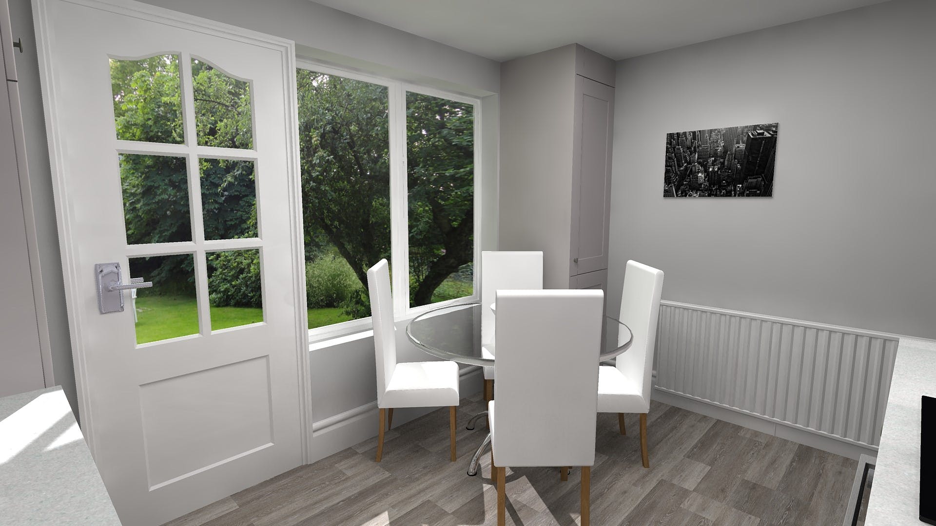
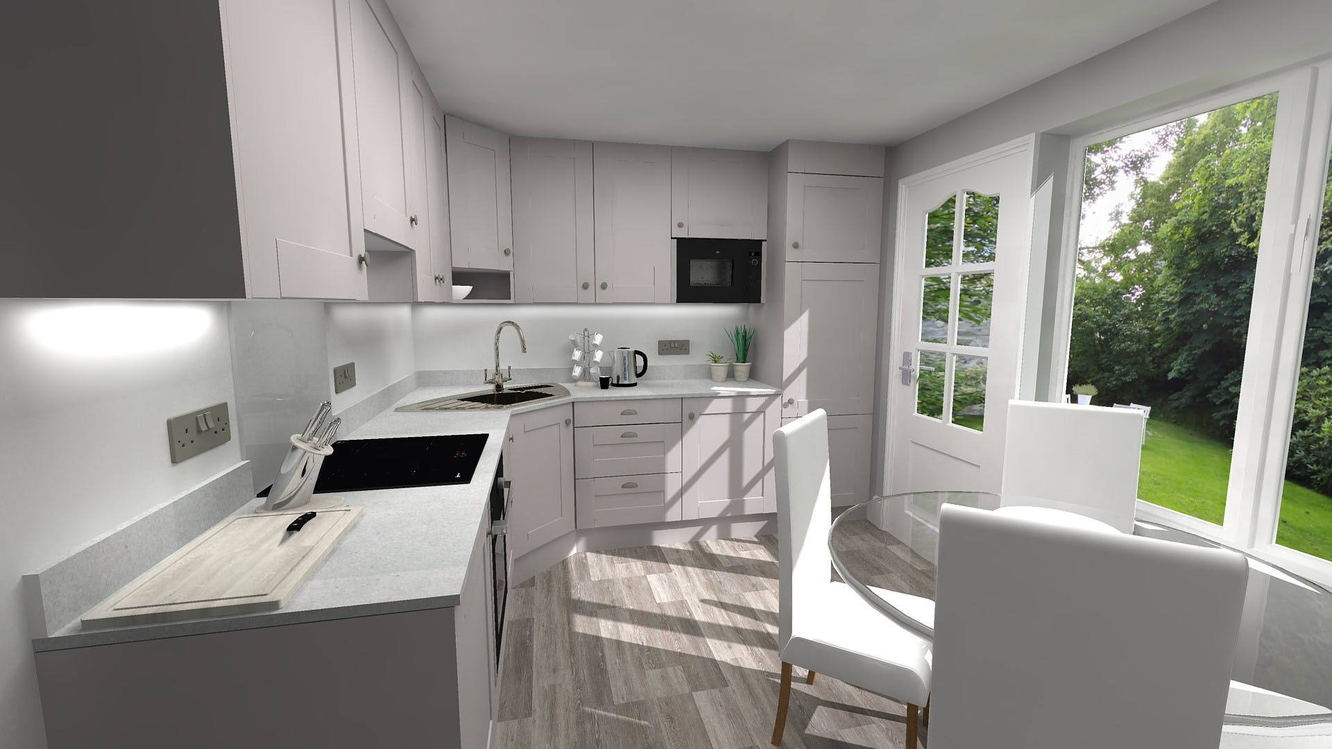
A dark and dated L-shaped kitchen design was transformed into a bright, open, and airy classic kitchen concept that would stand the test of time.
A result of multiple recommendations from existing customers Mr Brotherton visited our Leeds Kitchen Showroom with a view to gathering further information on our full kitchen design and fitted kitchen service while enhancing his own design ideas and inspirational requirements for the renovation.
Greeted by More Kitchens Project Manager, Rob, who discussed our full service offering in detail, while proposing some preliminary design ideas, Mr Brotherton was impressed and booked a design appointment, taking his project to the next level.
Visited by More Kitchens Senior Designer, Julie, through detailed discussion it soon became clear what Mr Brotherton wanted the project to achieve. Providing Julie with a brief, and several key requirements, Julie was able to offer expert help and advice with regards to a design.
First and foremost, plenty of kitchen worktop space and kitchen storage was paramount, however this had to be delivered while maintaining a separate eating area. Both fundamental requirements of the renovation meant Julie had to be very clever when reconfiguring the available space.
To start Julie recommended the installation of a corner sink, utilising what it typically classed as ‘dead space’. This meant the straight surfaces increased the amount of kitchen worktop, therefore meeting the first of three key requirements.
Taking this even further Julie proposed that the microwave be ‘built-in’ to the kitchen storage to ensure a clean and clear surface that wasn’t compromised by appliances.


Secondly, a functional and practical design was key. This meant the kitchen design had to seamlessly flow from appliance to appliance while ensuring everything was easily accessible. Wanting a streamlined finish Julie suggested that all appliances be either built-in or integrated, and at eye level where possible for access.
Really utilising the L-Shaped space Julie also designed the room with a combination of kitchen storage options, from base units, wall units, larder units and slim line cupboards every inch of space was used which met the second of the three requirements.

Finally, wanting a bright, open and airy design Julie proposed
a Kashmir colour scheme, presented via a shaker style door. Creating a timeless
classic feel Julie paired this with brush finished cup kitchen handles, a light kitchen worktop with matching upstands and a complimentary
driftwood flooring with new crisp white skirting boards.
Share this Post


_-_Sold_-_View_1.jpg?auto=compress%2Cformat&cs=strip&fit=clip&h=400&ixlib=php-1.1.0&w=400&s=f455aa44dac2fe3872fc745523a612d8)


