Linear Open Plan Kitchen Case Study | Harrogate | North Yorkshire
Published: 8 June 2021
An existing customer who had their bathroom fully renovated less than 12 months previous was that impressed with the delivered service, quality of workmanship and professionalism of our people and processes that when ready to explore their options with regards to renovating their kitchen they got back in touch to see how we could help.
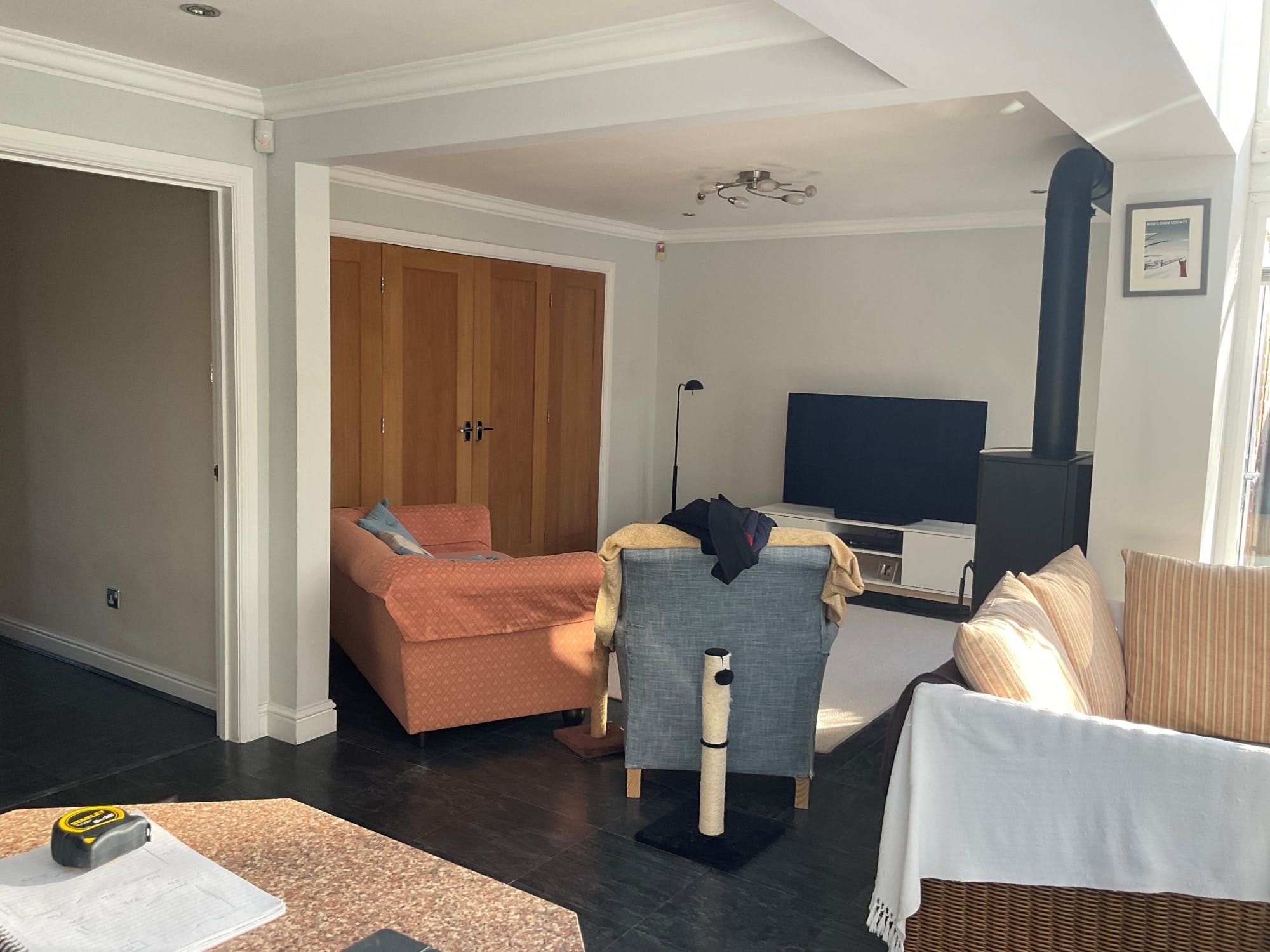
An existing U-Shaped kitchen design and separate utility, that in its time, with cream high gloss kitchen cupboards, would have been the epitome of a true modern contemporary concept was now starting to tire and required a full renovation overhaul.


Having had an extension built a few years previous the open plan kitchen-diner also had a relaxation area that acted as the hub of the home meaning the renovation of the multi-purpose space needed to accommodate formal dining, leisure and functionality but also be a fun space to host and entertain.

With a clear idea of what they wanted to achieve with regards to a design and layout, the client was forthcoming in the notion that the renovated space must deliver that all important wow factor.
Having seen a feature print in a magazine this would become the kitchen statement and everything else with regards to the design, fixture choices, colour schemes, kitchen lighting, location of key appliances and general layout would hang off it and need to subtly compliment the striking concept.


Also wanting to incorporate a kitchen island but unsure how this would fit within the available space (a common problem we help solve – read our article on how to design a kitchen island to find out more), Senior Designer, Julie, had her creative work cut out on this particular project.
Firstly, and starting with the key requirements of the project as highlighted above, Julie began with orchestrating the kitchen layout to create the space and deliver the concept the customers required.
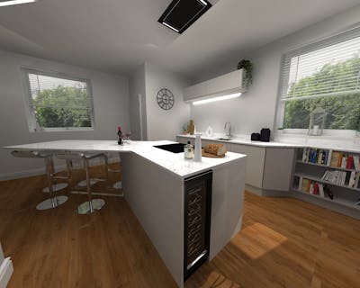
Switching from a U-shaped to an L-shaped kitchen design, Julie was able to feature the statement wall art on the end wall, elongating the room and facilitating the installation of a kitchen island.


Opening up the space, Julie kept the window wall free by suggesting floor to ceiling units on the opposing wall which would act as increased kitchen storage but also a housing for the appliances, lending the overall design to a clean and streamlined finish.


With the design starting to flow Julie pulled the Linear Kitchen concept together with the installation of slimline white quartz kitchen worktops and contrasting denim blue kitchen units, which elevated elements of blue tones from the feature print.
Finishing the open plan space off, large and small staggered kitchen lighting in the form of lava lights were added over the kitchen island with new driftwood kitchen flooring applied continuously throughout the whole area, delivering both a consistent concept and seamless synergy.

*
Efficient and well-planned
This is the third time we have used More Kitchens, part of the Passmore Group, and we have always been very pleased with the service we have received.
The planning and execution are excellent and in all three instances, everything has gone to plan. All the staff/tradesmen are efficient, very pleasant and keep you posted as to how the job is going.
I would definitely use them again.
Share this Post


.jpg?auto=compress%2Cformat&cs=strip&fit=clip&h=400&ixlib=php-1.1.0&w=400&s=d4201a1abfca044618c359fa5b7c4175)

.jpg?auto=compress%2Cformat&cs=strip&fit=clip&h=400&ixlib=php-1.1.0&w=400&s=b47857502f21815b86cebf324ac531c1)


