Linear Kitchen Island Case Study | Ilkley | West Yorkshire
Published: 11 May 2021
The hub of the family home, this restricted and busy kitchen required a large-scale remodel, involving significant building work and a complete reconfiguration of the lower levels in order facilitate the functional open plan design they desired.
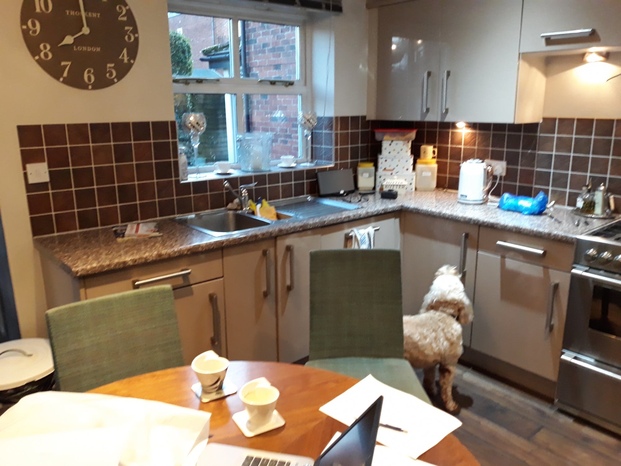
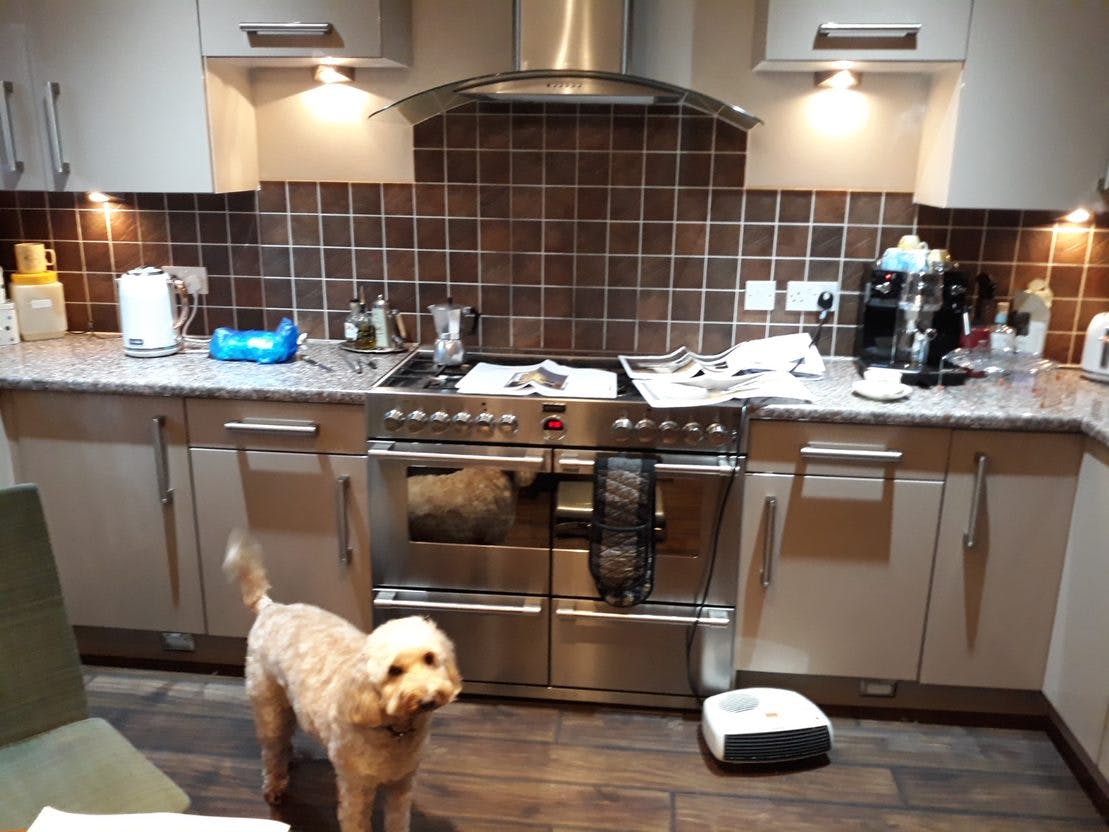
An existing contact, having been in touch with regards to an extension a number of years previous, when the time came to invest in the significant renovation of their kitchen the clients felt confident in our extensive build capabilities, coupled with our full kitchen design and fitted kitchen service, that we could help them achieve all aspects of the work.
With the existing property made up of smaller, more compact rooms, when Senior Designer, Simon, visited on the initial design appointment to survey, and discuss the project in more detail, it quickly became clear that a complete reconfiguration of the ground floor would be required to deliver on all the project aims.
Spending 90 percent of their time in the kitchen, the family wanted to create a large, open-plan, space they could host, entertain, and socialise. In addition, they wanted to mix fun with formal, meaning the renovation had to embody a ‘best of both worlds’ approach to modern dining in a contemporary and calming aesthetical setting.
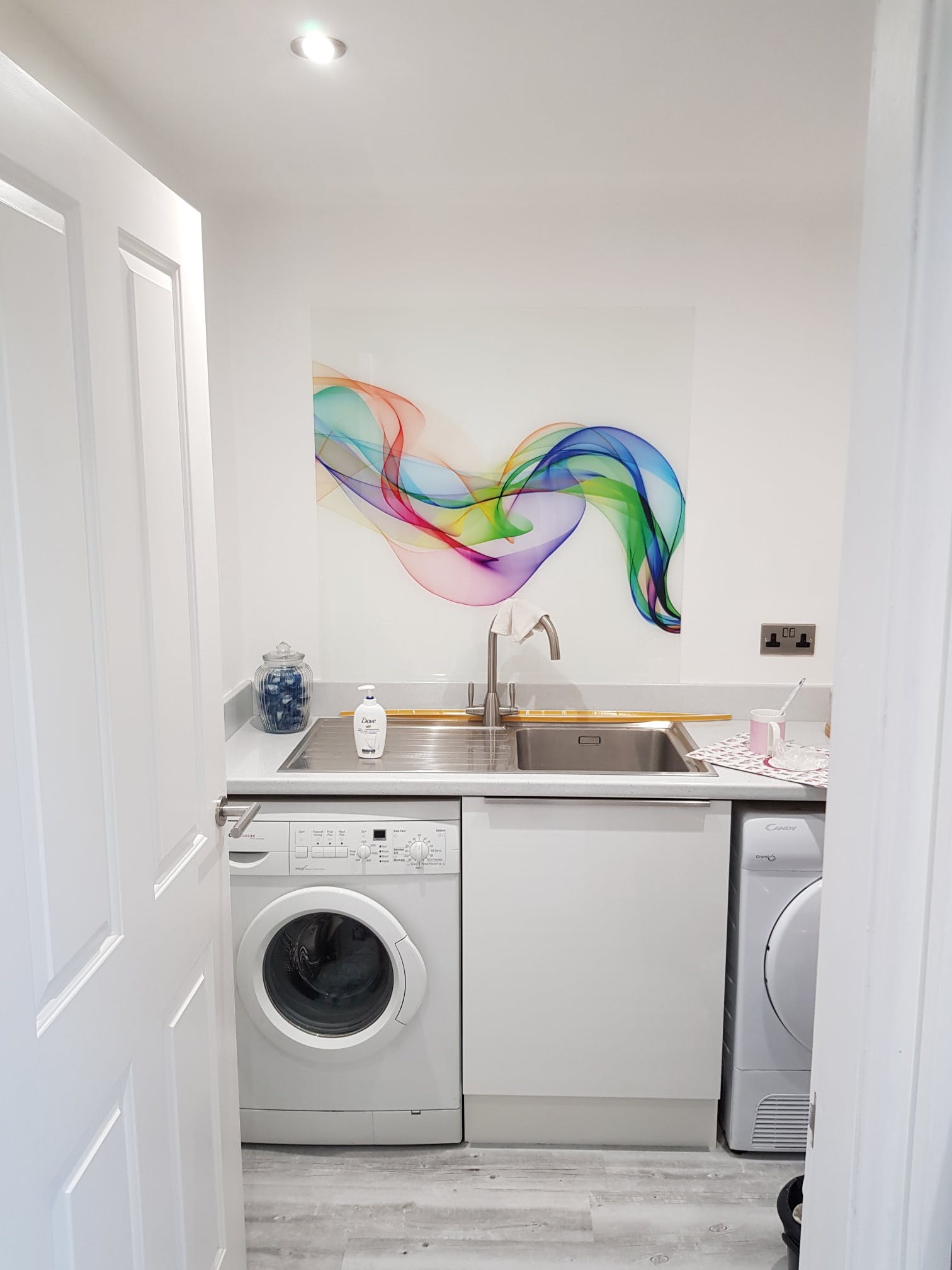
Firstly, looking to open the available space, Simon began by exploring how he could enlarge the kitchen, which resulted in removing several internal walls while incorporating some of the integral garage which would be later used to house the newly created utility.
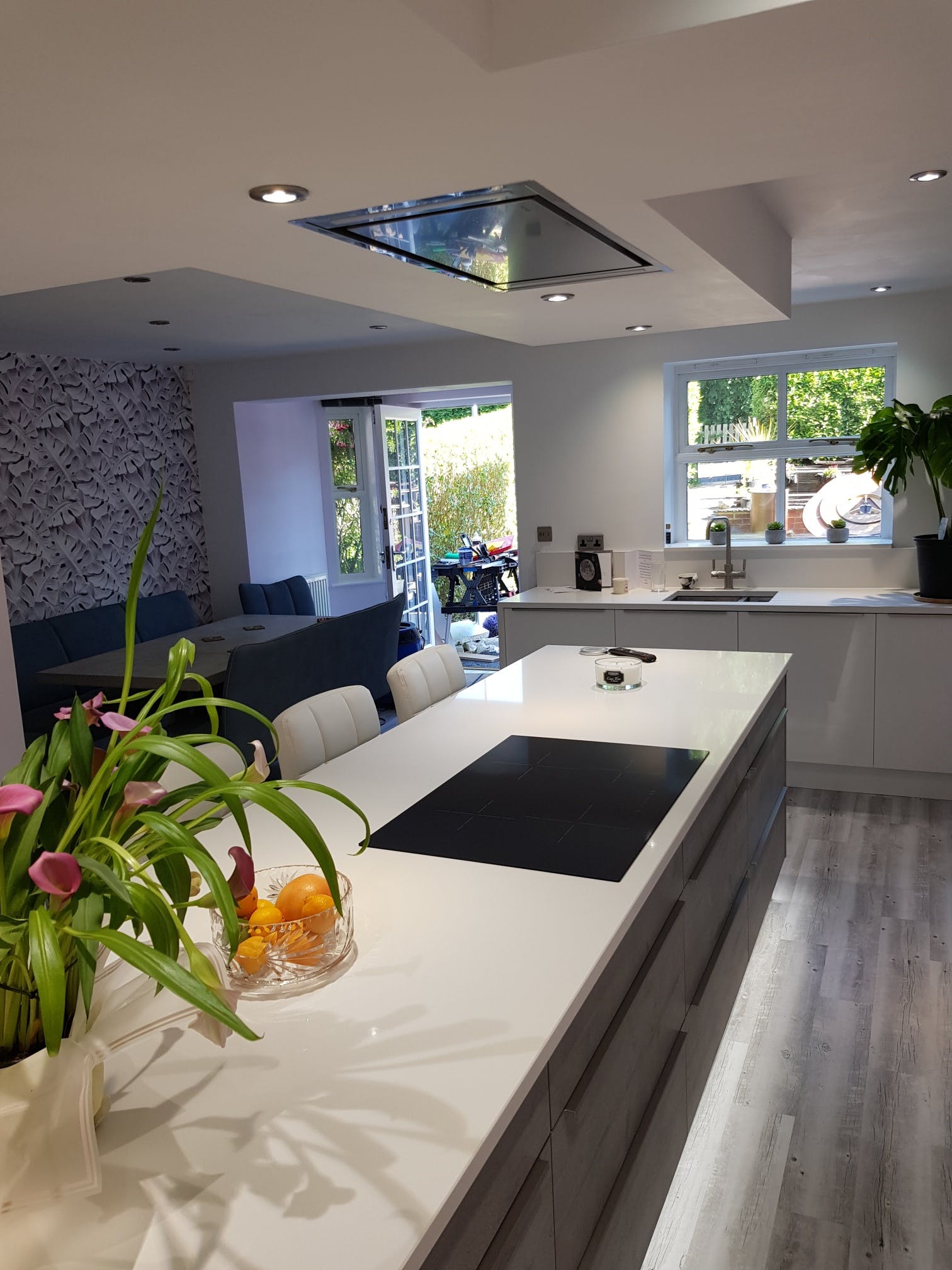
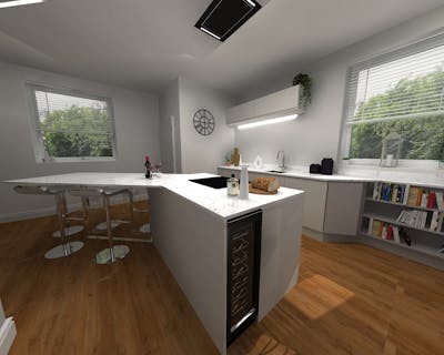
Balancing fun with formal once the space was created Simon was able to feature a large kitchen island, which would include a breakfast bar style seating area, and a formal dining area, where they could sit as a family to socialise of an evening or weekend.


Preferring a sleek and minimalistic finish Simon suggested utilising a linear kitchen design to amplify the modern look and feel, expressed through a combination of straight lines, square finishes and a no curve concept.
Enhancing to the cool, urban, Germanic look and feel, Simon used contrasting colours on key elements and created a tall bank of units, to act as both kitchen storage and an appliance housing, helping keep the slimline kitchen worktops clean and de-cluttered.

Following the golden triangle of kitchen design Simon designed the open-plan space to functionally flow, heightening its practicality when in use. With the integrated oven and microwave housed in the tall bank of units, the hob located in the centre of the kitchen island and the remaining core cleaning fixtures installed at the opposite end of the room the reconfiguration worked seamlessly when navigating from one appliance to another.

Finishing the works off, while adding to the bright, open, and airy setting while wanting to bring the outdoors in, especially during the warmer months, Simon suggested adding bi-fold doors, which would open out into the garden in summer, perfect for family BBQ’s.
Share this Post


.jpg?auto=compress%2Cformat&cs=strip&fit=clip&h=400&ixlib=php-1.1.0&w=400&s=d4201a1abfca044618c359fa5b7c4175)
.jpg?auto=compress%2Cformat&cs=strip&fit=clip&h=400&ixlib=php-1.1.0&w=400&s=b47857502f21815b86cebf324ac531c1)


